














(01) of 06
Oleander CeramicsIdentity2026
Vessel
A name, a mark and a glaze-chip colour system for a ceramics studio moving from market stalls to stockists.
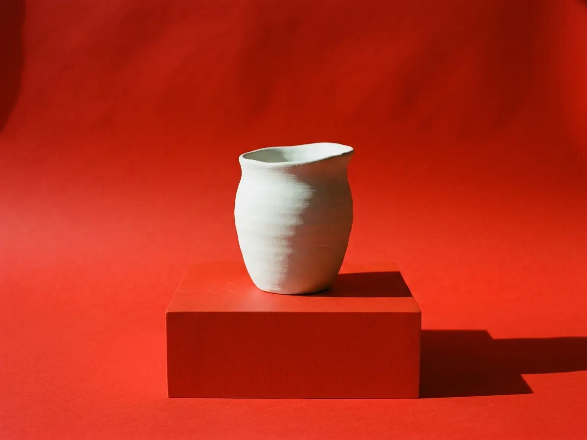
Oleander had a loyal local following and a look that changed with every batch. Stockists wanted something they could recognise on a shelf from across the room.
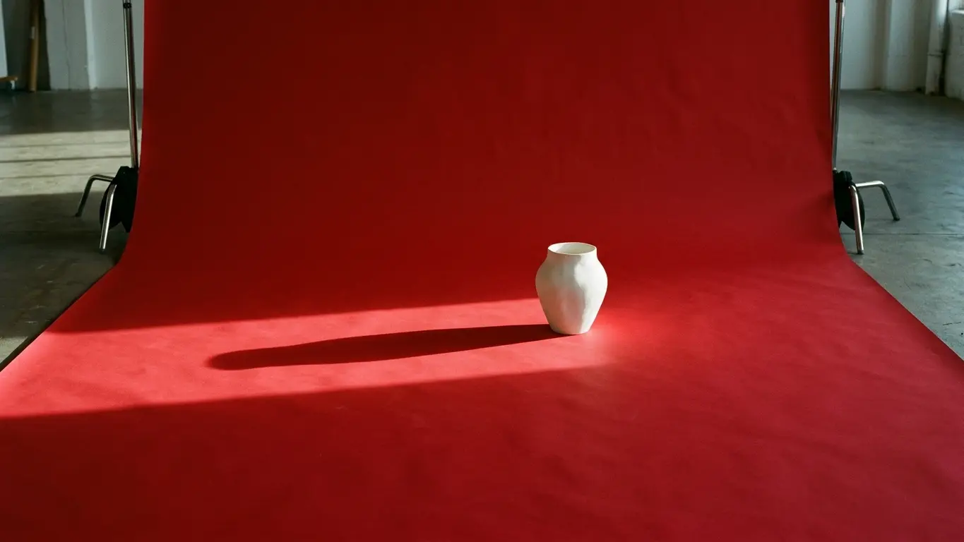
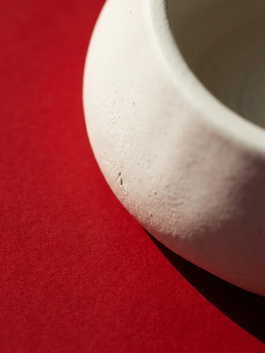
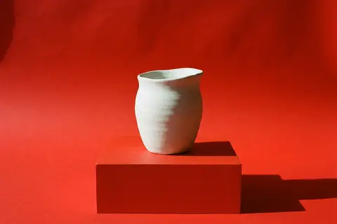
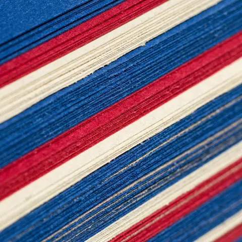
We started from the studio's own process: every glaze is tested on a small chip before it reaches a pot. Those chips became the colour system, and the shape of the chip became the mark.
The result is a small identity the two founders run themselves, with labels printed in the studio and a guide short enough to pin above the kiln.
Visit the projectCredits
- Scope
- Naming, logotype, colour, packaging
- Photography
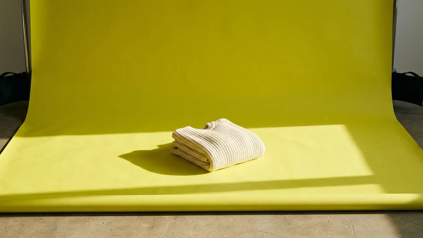
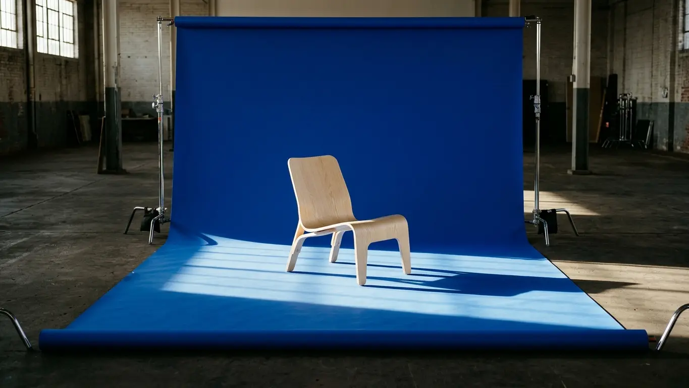
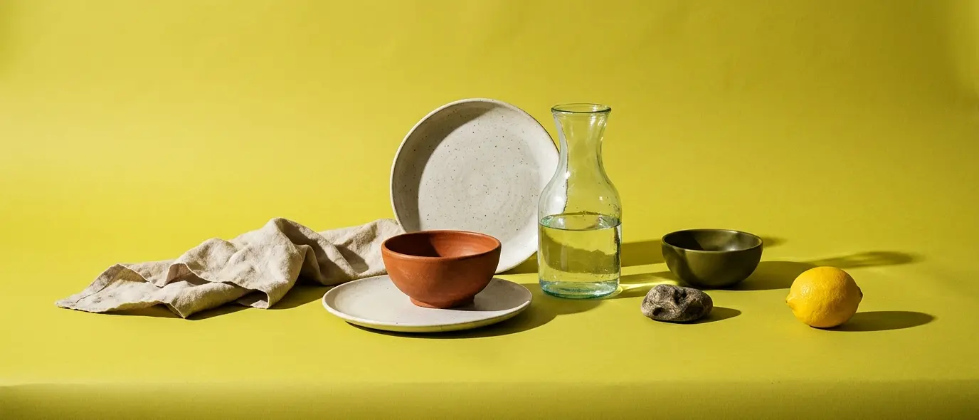
- Studio still lifes, 3 days
- Team
- Miro Halste with a freelance type designer
- Outcome
- Now stocked in 14 shops